 What Is Your Recession Buying You?
(Yicai Global) Aug. 5 -- Last week, a number of countries released their Q2 National Accounts, which showed precipitous drops in GDP. Clearly, economic conditions are bad everywhere, but differing reporting conventions make it challenging to compare the extent of the dislocation across countries. The US (-33 percent) reports its GDP as an annualized change from the previous quarter. The European Union (-12 percent) reports a simple quarter-over-quarter change and China (+3 percent) reports on a year-over-year basis. Cross country comparisons are further complicated by the timing of the outbreak of the virus, which was earlier in China than elsewhere, suggesting that it may be misguided to simply focus on Q2’s results.
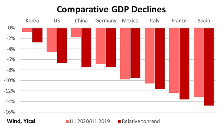
In Figure 1 below, I present two standardized ways of looking at the outturns of the eight G20 countries that have reported their 2020 Q2 data. The first metric – the pink bars – is simply the percent change in GDP from the first half of 2019 to the first half of 2020. On this basis, GDP declined by the least in Korea (1 percent) and the most in Spain (13 percent). GDP in China fell by just under 2 percent and by almost 5 percent in the US.
But does this comparison tell the whole story?
Trend GDP growth in China is much more rapid than in the US. Thus, if the Chinese and US economies were to have declined by a similar amount, more growth would have been foregone in China. The red bars in Figure 1 remedy this by presenting the change in 2020H1 GDP relative to trend. I take trend to be the actual 2019 GDP growth rate. Again, Korea has the smallest decline and Spain has the biggest. However, now the fall is slightly larger in China (8 percent) than in the US (7 percent), reflecting China’s relatively high trend growth.
Figure 1
GDP has contracted all around the world for pretty much the same reason. Countries have enacted public health policies designed to stop the spread of Covid-19 and these policies have put a sharp break on economic activity. The hope is that once the virus is brought under control, business can get back to normal.
So how effective have countries been in controlling Covid-19?
It would be inappropriate to measure success simply by comparing infection numbers across countries. We would expect populous countries to have more infections. We would also expect countries with mobile populations to have more infections.
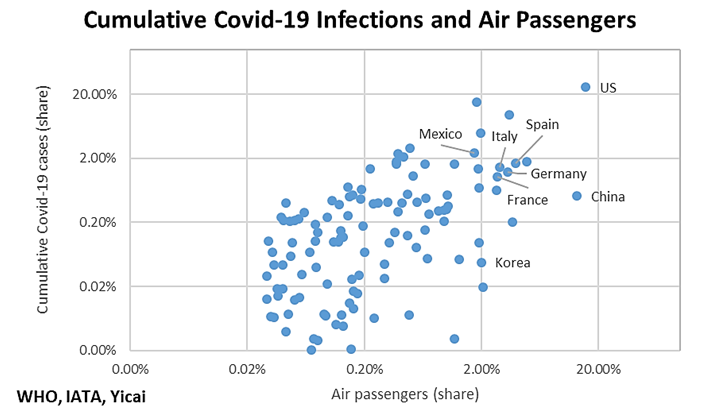
In order to establish a baseline against which we can compare the actual cross-country evolution of the virus, I turn to air passenger data compiled by the International Air Transport Association (IATA). These data reflect all passengers travelling to, from and within the respective country in 2018. I then compare the IATA numbers to World Health Organization (WHO) data on cumulative Covid-19 infections by country to July 31.
There are 128 countries that appear in both the IATA and WHO datasets. For each country, I calculate its share of air passenger traffic and of cumulative Covid-19 infections. For example, Italy accounted for 2.9 percent of the 128 countries’ air passenger traffic in 2018 and 1.5 percent of their Covid-19 infections.
The two shares series have a correlation coefficient of 0.66, which means that two-thirds of the variance of the infection shares can be “explained” by the air passenger traffic shares. In Figure 2, I show the scatter plot of the data below using log scales and I identify the eight G20 countries that have reported their 2020Q2 GDP data.
Figure 2
Having established a naïve baseline for infections, we can now compare countries’ success in controlling the virus. We do this by calculating “Covid-19 gaps”, which are simply each country’s share of air passenger traffic minus its share of Covid-19 infections. A positive gap indicates that a country was successful in limiting infections below what we might have expected based on its fundamentals.
The Covid-19 gaps are illustrated by the green bars in Figure 3. China had the biggest positive gap of all 128 countries in our sample (13.0 – 0.5 = 12.5 percent). The US and Mexico had negative gaps, which means that infection rates in these countries exceeded what we might have expected, based on the air passenger traffic data. The other five countries had positive gaps of 1-2 percent, indicating moderate success in containing the virus.
We can go one step further and estimate sacrifice ratios, which are the amount of Covid-19 gap obtained by the “sacrifice” of one percentage point of forgone GDP. We can calculate this measure of how big a public health benefit was “purchased” by the foregone GDP as the Covid-19 gaps (green bars in Figure 3) divided by the decline in GDP relative to trend (the red bars in Figure 1). The sacrifice ratios are shown as the black dots in Figure 3.
Figure 3
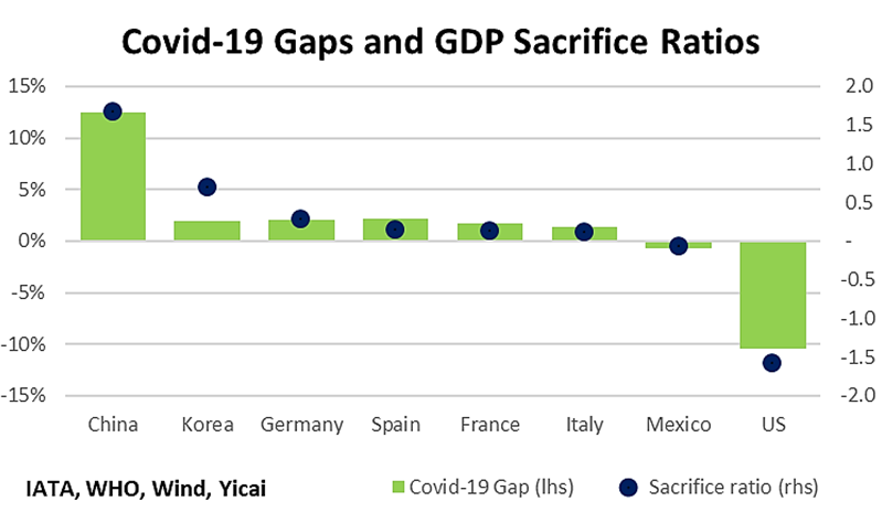
The sacrifice ratios allow us to compare strategies across countries. For example, in order to offset a sharp decline in its exports, Korea pursued a no-lockdown strategy and engaged in very large fiscal stimulus. It was not indifferent to the virus, as it aggressively pursued mass testing and contact tracing. In contrast, China has been willing to rapidly lock down virus hot spots, but its fiscal support is just a fraction of Korea’s and it forwent a much greater loss of GDP. China’s sacrifice ratio is 1.7. This means for each percentage point of foregone GDP, it gained 1.7 percentage points of Covid-19 gap. Korea’s sacrifice ratio was 0.7, indicating a smaller public health gain per unit economic contraction.
A caveat here. The sacrifice ratio analysis supposes that each country values forgone GDP and public health gains equally and this may not be the case. Nevertheless, it illustrates that, for some countries, the GDP loss has not been in vain and, by limiting the spread of the virus, these countries have set the stage for more rapid economic growth in the future.